Configure the Viewer through code
This tutorial will walk you through using the Blueprint APIs to better control the layout and appearance of your data in the Rerun Viewer in Python.
This walkthrough is based on the stock charts example. The main differences between this tutorial and the linked example are related to additional processing of command-line flags, which are omitted here for simplicity.
All of the examples in this tutorial use the exact same data. However, by changing the blueprint using small statements such as:
rrb.Blueprint(
    rrb.Vertical(
        rrb.TextDocumentView(name="Info", origin="/stocks/AAPL/info"),
        rrb.TimeSeriesView(name="Chart", origin="/stocks/AAPL"),
        row_shares=[1, 4],
    )
)
we will completely change the way the data is presented.
Create an environment for the example create-an-environment-for-the-example
We start by creating a new virtual environment and installing the Rerun SDK along with the dependencies we will use in this example.
On Linux or mac:
mkdir stocks_example
cd stocks_example
python -m venv venv
source venv/bin/activate
pip install rerun-sdk humanize yfinance
On windows:
mkdir stocks_example
cd stocks_example
python -m venv venv
.\venv\Scripts\activate
pip install rerun-sdk humanize yfinance
Create your script create-your-script
In your project folder, add a new file, stocks.py.
First, we import the necessary libraries:
#!/usr/bin/env python3
import datetime as dt
import humanize
import pytz
import yfinance as yf
from typing import Any

import rerun as rr
import rerun.blueprint as rrb
Next, we create some helper functions for style data and a template for an info card:
brand_colors = {
    "AAPL": 0xA2AAADFF,
    "AMZN": 0xFF9900FF,
    "GOOGL": 0x34A853FF,
    "META": 0x0081FBFF,
    "MSFT": 0xF14F21FF,
}


def style_plot(symbol: str) -> rr.SeriesLine:
    return rr.SeriesLine(
        color=brand_colors[symbol],
        name=symbol,
    )


def style_peak(symbol: str) -> rr.SeriesPoint:
    return rr.SeriesPoint(
        color=0xFF0000FF,
        name=f"{symbol} (peak)",
        marker="Up",
    )


def info_card(
    shortName: str,
    industry: str,
    marketCap: int,
    totalRevenue: int,
    **args: dict[str, Any],
) -> rr.TextDocument:
    markdown = f"""
- **Name**: {shortName}
- **Industry**: {industry}
- **Market cap**: ${humanize.intword(marketCap)}
- **Total Revenue**: ${humanize.intword(totalRevenue)}
"""

    return rr.TextDocument(markdown, media_type=rr.MediaType.MARKDOWN)
And finally, we create our main function that queries and logs the data:
def main() -> None:
    symbols = ["AAPL", "AMZN", "GOOGL", "META", "MSFT"]

    # Use eastern time for market hours
    et_timezone = pytz.timezone("America/New_York")
    start_date = dt.date(2024, 3, 18)
    dates = [start_date + dt.timedelta(days=i) for i in range(5)]

    # Initialize Rerun and spawn a new viewer
    rr.init("rerun_example_blueprint_stocks", spawn=True)

    # This is where we will edit the blueprint
    blueprint = None
    #rr.send_blueprint(blueprint)

    # Log the stock data for each symbol and date
    for symbol in symbols:
        stock = yf.Ticker(symbol)

        # Log the stock info document as timeless
        rr.log(f"stocks/{symbol}/info", info_card(**stock.info), timeless=True)

        for day in dates:
            # Log the styling data as timeless
            rr.log(f"stocks/{symbol}/{day}", style_plot(symbol), timeless=True)
            rr.log(f"stocks/{symbol}/peaks/{day}", style_peak(symbol), timeless=True)

            # Query the stock data during market hours
            open_time = dt.datetime.combine(day, dt.time(9, 30), et_timezone)
            close_time = dt.datetime.combine(day, dt.time(16, 00), et_timezone)

            hist = stock.history(start=open_time, end=close_time, interval="5m")

            # Offset the index to be in seconds since the market open
            hist.index = hist.index - open_time
            peak = hist.High.idxmax()

            # Log the stock state over the course of the day
            for row in hist.itertuples():
                rr.set_time_seconds("time", row.Index.total_seconds())
                rr.log(f"stocks/{symbol}/{day}", rr.Scalar(row.High))
                if row.Index == peak:
                    rr.log(f"stocks/{symbol}/peaks/{day}", rr.Scalar(row.High))


if __name__ == "__main__":
    main()
Run your script run-your-script
You can now run the script and view the results in the Rerun Viewer:
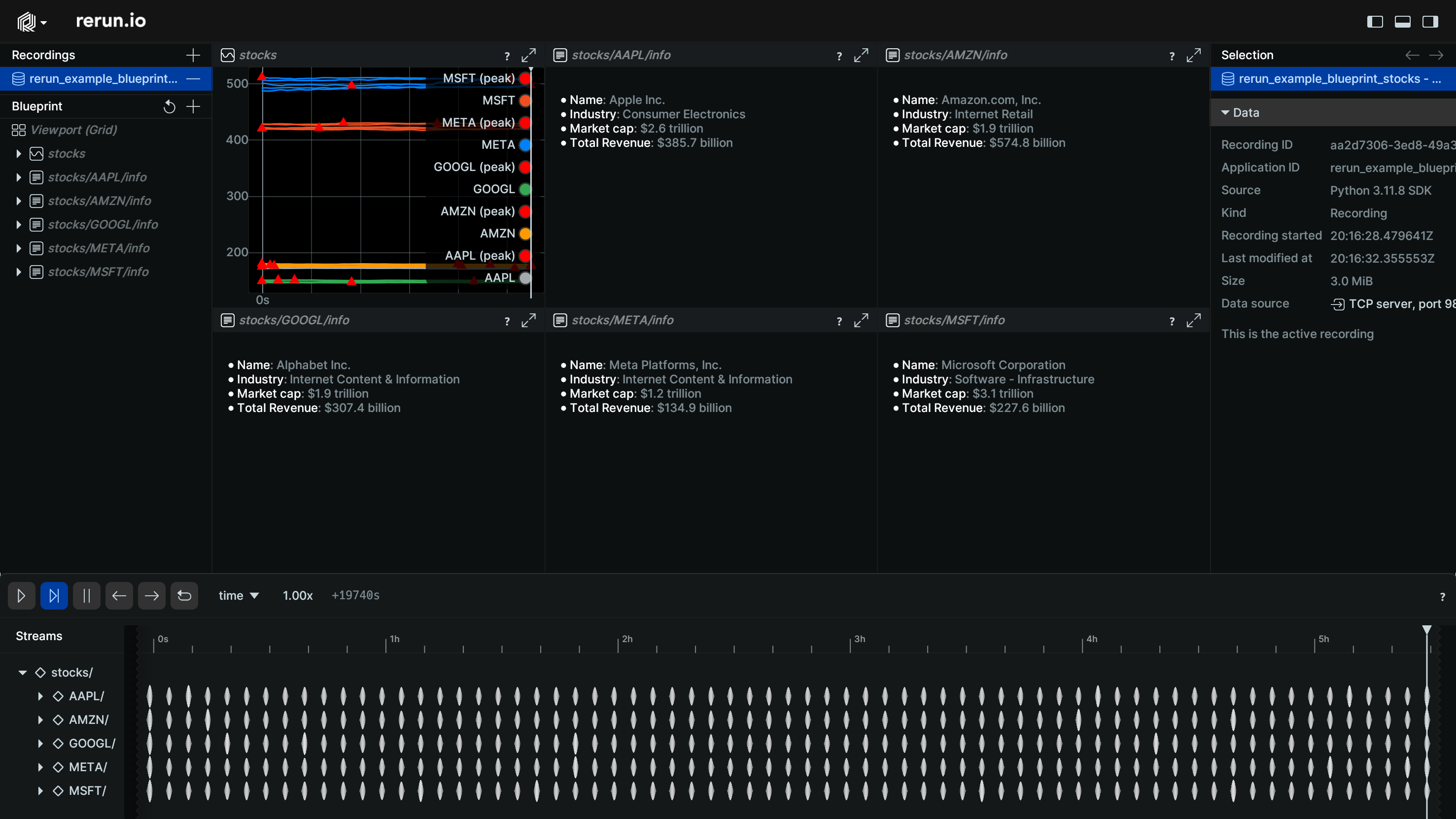
python stocks.pyYou should see the application launch and display the stock data, but you will also notice the layout is far from ideal:
Create a blueprint create-a-blueprint
To improve the layout, we will now use the blueprint APIs to create some custom layouts.
All we need to do is modify the section of the code that currently reads:
    # This is where we will edit the blueprint
    blueprint = None
    #rr.send_blueprint(blueprint)
Create a view for an origin create-a-view-for-an-origin
Replace these lines with the following:
    # Create a single chart for all the AAPL data:
    blueprint = rrb.Blueprint(
        rrb.TimeSeriesView(name="AAPL", origin="/stocks/AAPL"),
    )
    rr.send_blueprint(blueprint)
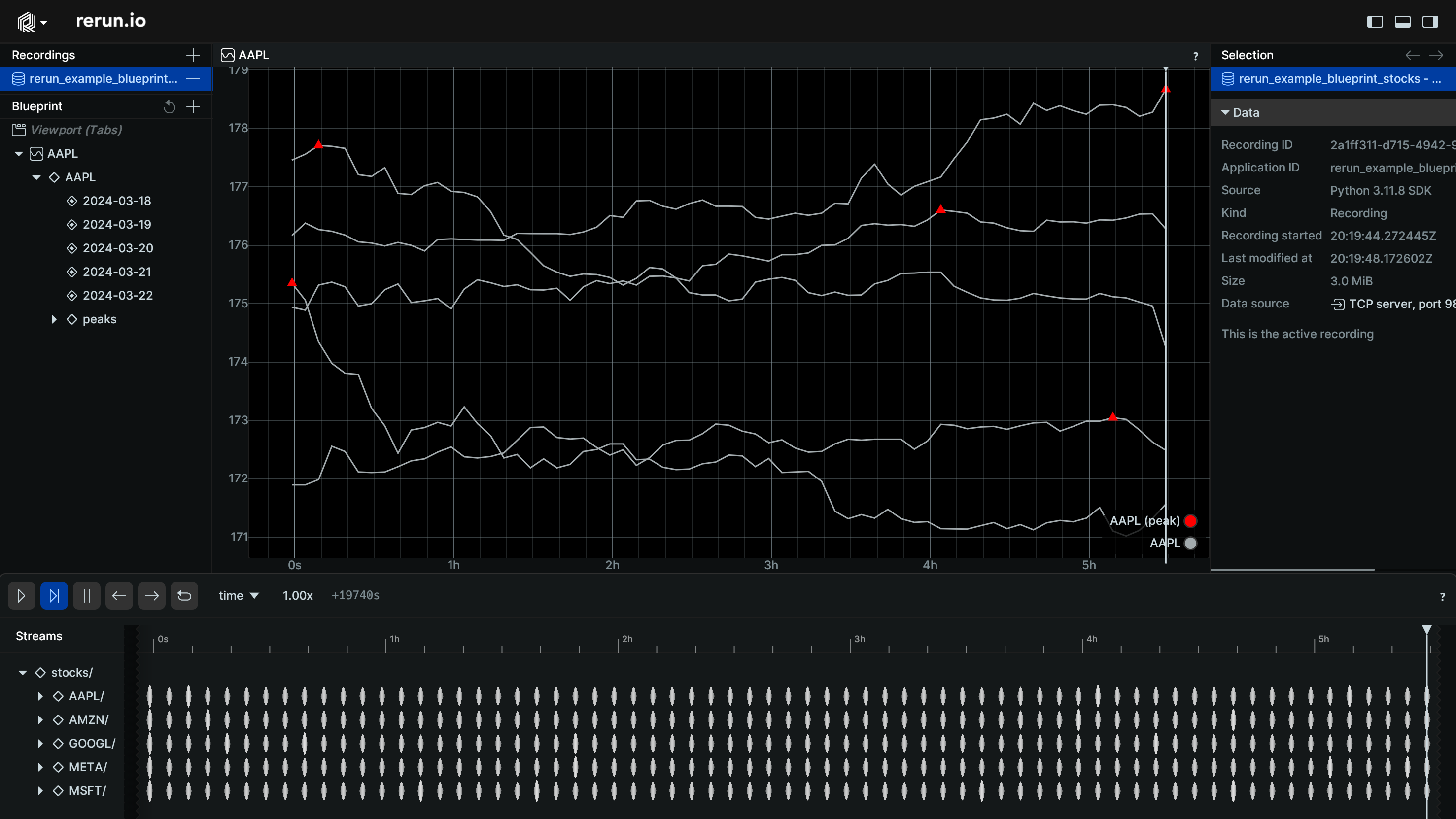
This blueprint uses the origin parameter to scope the view to just a portion of the entity tree.
If you run the script again, you should see a single chart for the AAPL data:
Control the default panel state control-the-default-panel-state
In addition to controlling the data, you can also control the default state of the blueprint, selection, and time panels.
Let's modify the code again to include additional blueprint specifications for these:
    # Create a single chart for all the AAPL data, and collapse the selection and time panels:
    blueprint = rrb.Blueprint(
        rrb.TimeSeriesView(name="AAPL", origin="/stocks/AAPL"),
        rrb.BlueprintPanel(expanded=True),
        rrb.SelectionPanel(expanded=False),
        rrb.TimePanel(expanded=False),
    )
    rr.send_blueprint(blueprint)
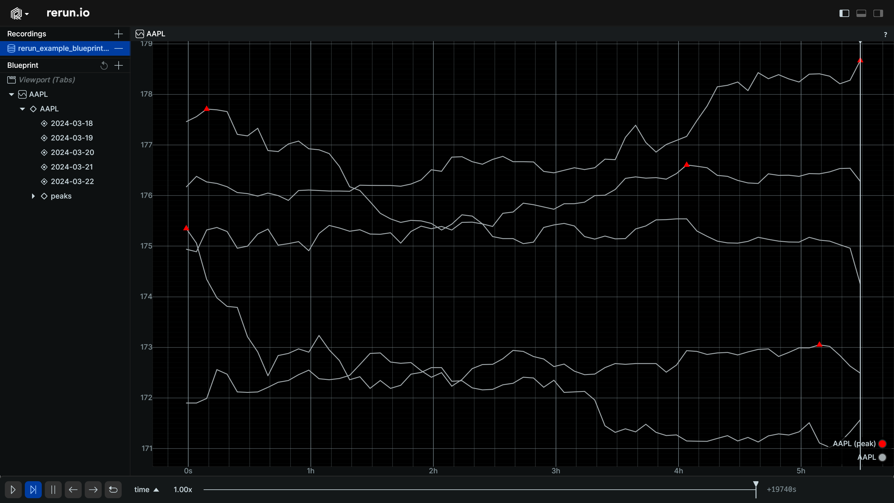
This time when you run the script, you will now see the panels start off collapsed, giving you a more focused view of your data:
Combining multiple views combining-multiple-views
When using blueprints, you don't have to limit yourself to a single view. You can create multiple views and use containers to combine them.
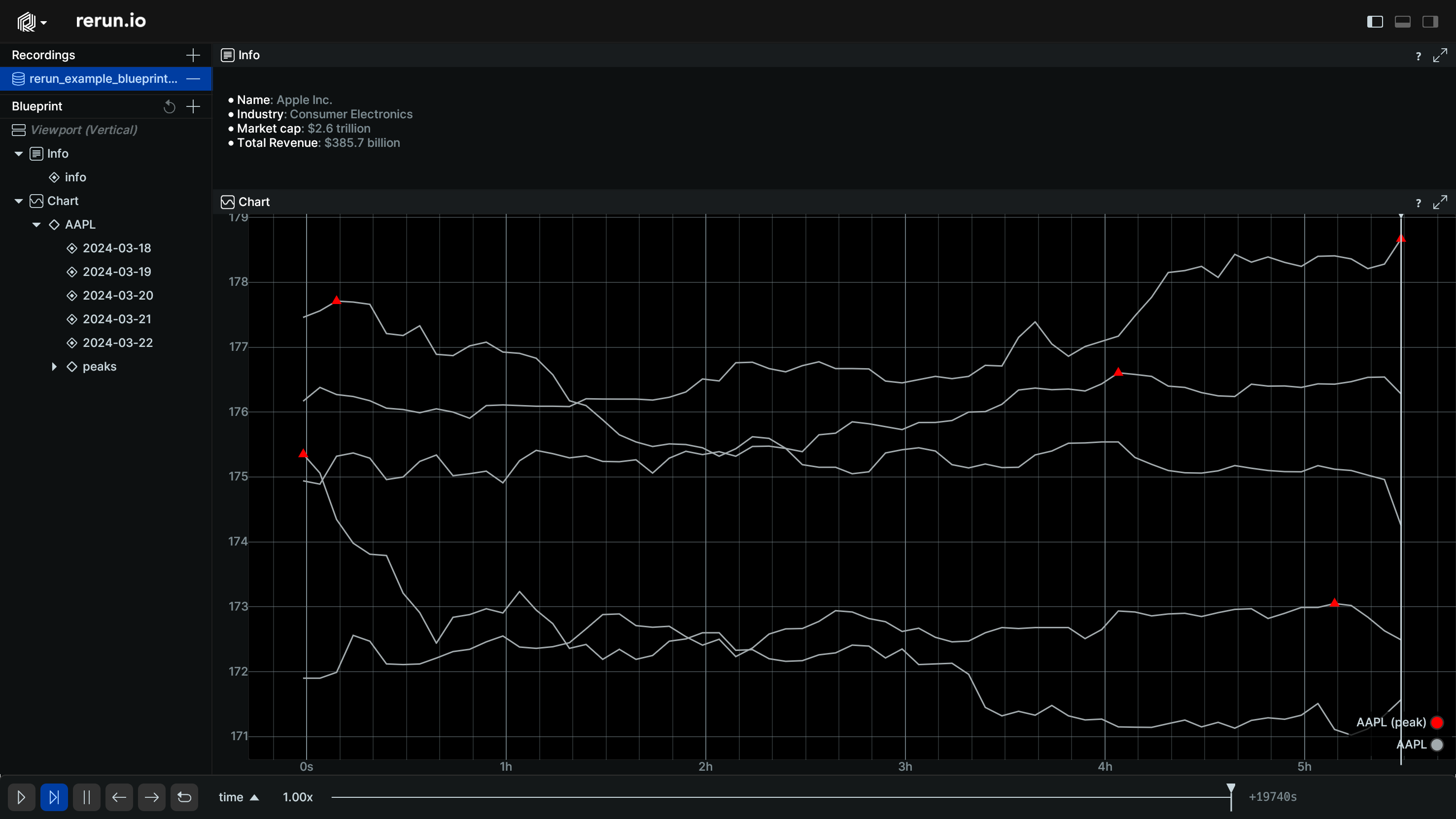
Let's modify the code to include the info card as well. We will use the Vertical container and the
row_shares parameter to control the relative size of the views:
    # Create a vertical layout of an info document and a time series chart
    blueprint = rrb.Blueprint(
        rrb.Vertical(
            rrb.TextDocumentView(name="Info", origin="/stocks/AAPL/info"),
            rrb.TimeSeriesView(name="Chart", origin="/stocks/AAPL"),
            row_shares=[1, 4],
        ),
        rrb.BlueprintPanel(expanded=True),
        rrb.SelectionPanel(expanded=False),
        rrb.TimePanel(expanded=False),
    )
    rr.send_blueprint(blueprint)
Running the script now produces two views stacked vertically:
Including specific contents including-specific-contents
Specifying the origin of a view is convenient, but sometimes you need more control. In this case, you can
specify the contents of a view by providing multiple content expressions.
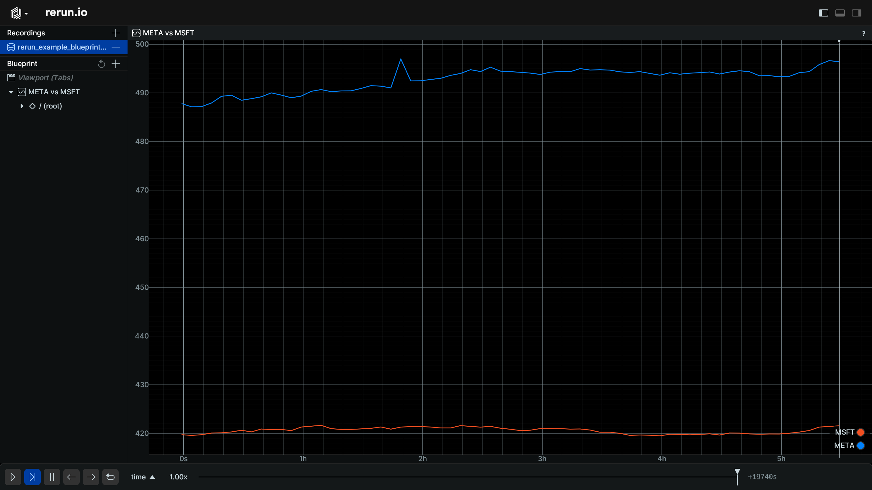
For example, we can create a stock that includes data from both META and MSFT for a single day on
the same chart. Using origin alone there is no way we could have expressed this:
    # Create a view with two stock time series
    blueprint = rrb.Blueprint(
        rrb.TimeSeriesView(
            name="META vs MSFT",
            contents=[
                "+ /stocks/META/2024-03-19",
                "+ /stocks/MSFT/2024-03-19",
            ],
        ),
        rrb.BlueprintPanel(expanded=True),
        rrb.SelectionPanel(expanded=False),
        rrb.TimePanel(expanded=False),
    )
    rr.send_blueprint(blueprint)
Running the script now produces a chart that combines data from multiple sources:
More complex filtering more-complex-filtering
Just specifying single path inclusions can also be challenging when dealing datasets that include large subtrees.
Filter expressions can be used to include or exclude data based on a path pattern. This pattern can optionally
start with $origin to refer to the origin of the given space, and can end with the wildcard /** to include
or exclude an entire subtree,
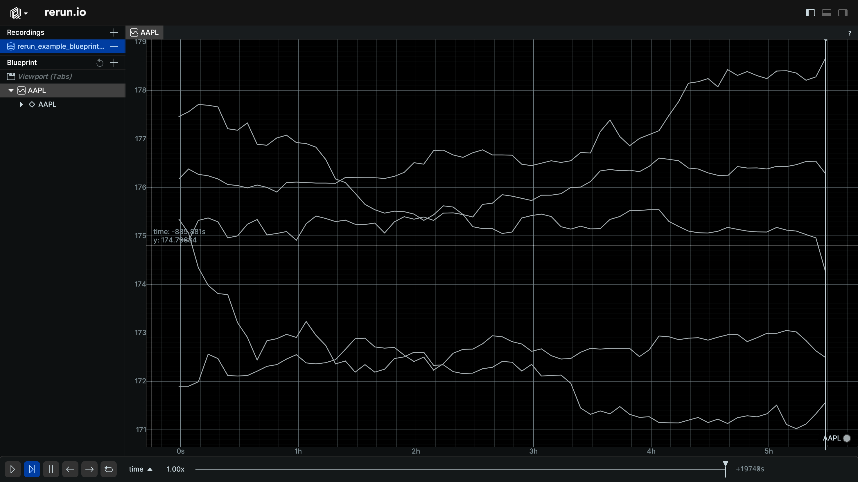
Going back to our single stock example, we can filter out the peaks data by excluding the peaks subtree:
    # Create a single chart for all the AAPL data and filter out the peaks:
    blueprint = rrb.Blueprint(
        rrb.TimeSeriesView(
            name="AAPL",
            origin="/stocks/AAPL",
            contents=[
                "+ $origin/**",
                "- $origin/peaks/**",
            ],
        ),
        rrb.BlueprintPanel(expanded=True),
        rrb.SelectionPanel(expanded=False),
        rrb.TimePanel(expanded=False),
    )
    rr.send_blueprint(blueprint)
When you run the script you will see that the data from the peaks subtree is no longer part of the view:
Programmatic layouts programmatic-layouts
Since these layouts are created by executing Python code, they can also be generated programmatically.
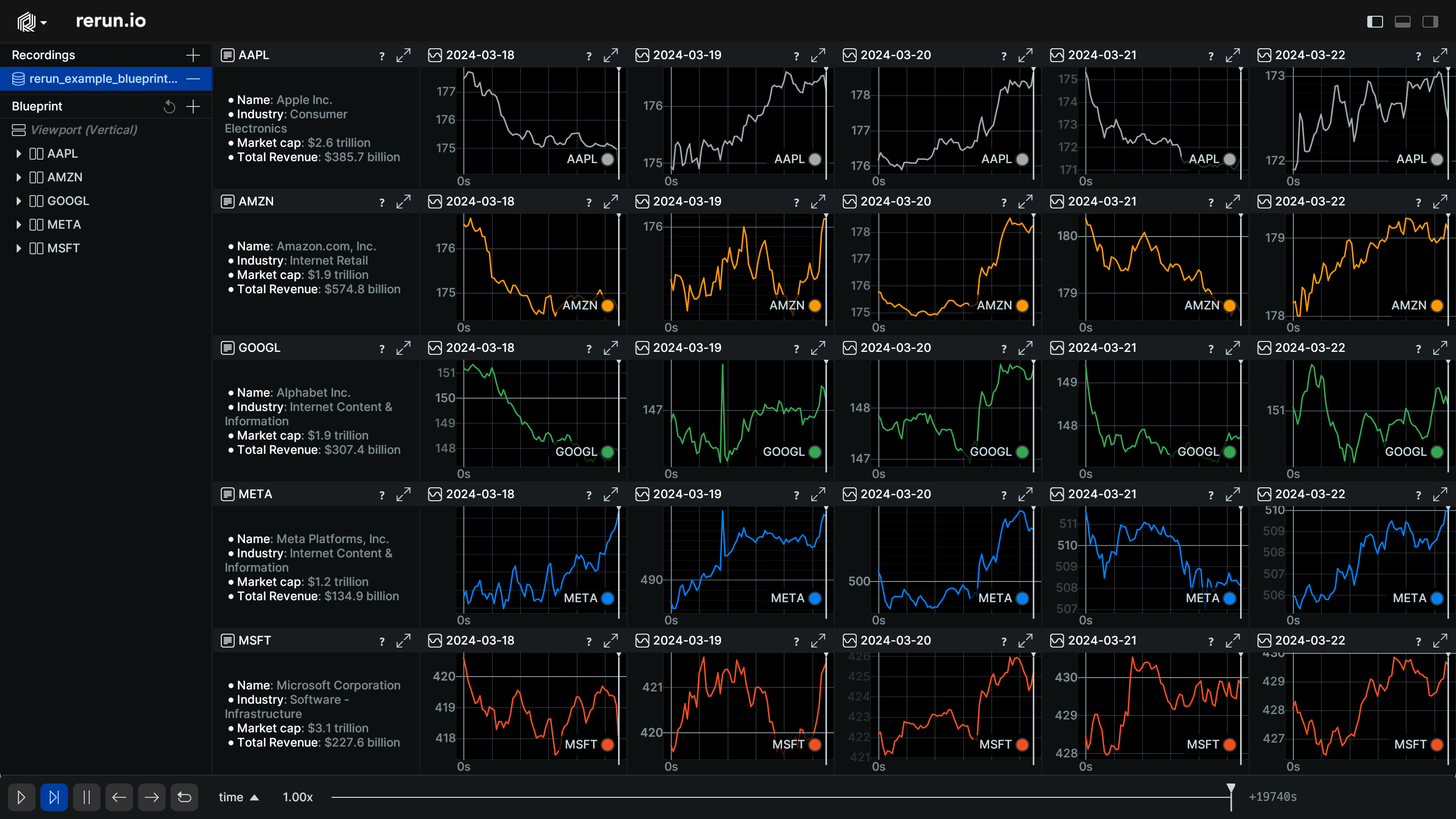
For example, we can create a create a separate view for every piece of data we were interested in. Setting this up by hand would be extremely tedious.
    # Iterate over all the symbols and days to log the stock data in a grid
    blueprint = rrb.Blueprint(
        rrb.Vertical(
            contents=[
                rrb.Horizontal(
                    contents=[
                        rrb.TextDocumentView(
                            name=f"{symbol}",
                            origin=f"/stocks/{symbol}/info",
                        ),
                    ]
                    + [
                        rrb.TimeSeriesView(
                            name=f"{day}",
                            origin=f"/stocks/{symbol}/{day}",
                        )
                        for day in dates
                    ],
                    name=symbol,
                )
                for symbol in symbols
            ]
        ),
        rrb.BlueprintPanel(expanded=True),
        rrb.SelectionPanel(expanded=False),
        rrb.TimePanel(expanded=False),
    )
    rr.send_blueprint(blueprint)
Running the script again this final chart is a significant improvement over the original heuristic-based layout:
